You have no items in your cart. Want to get some nice things?
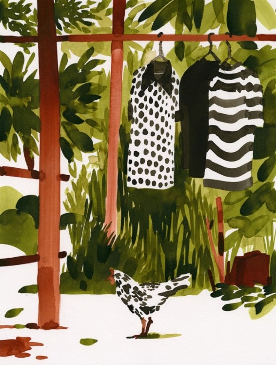
Go shoppingTo feel more comfortable on the humble side of life: that’s perhaps the mark of a true humorist. As I skimmed through these ink drawings of Christoph Niemann online, I ran into a rather simple image portraying a hen somewhere along the Mekong River and I thought, “There. That’s the artist at his best.” I didn’t care too much for the animation of Angkor Wat at sunrise, however suggestive it is, nor for the boutique-boat sliding down the river, a gratifying exercise in light, undoubtedly, nor for the picturesque scene of a local girl cleaning fish at the market. I liked the black-spotted bird under the black-spotted dress hanging against exuberance, the cartoonish arm waving over the current at dusk and blotting it white, the loaded cargo tricycle with a motorbike on top.
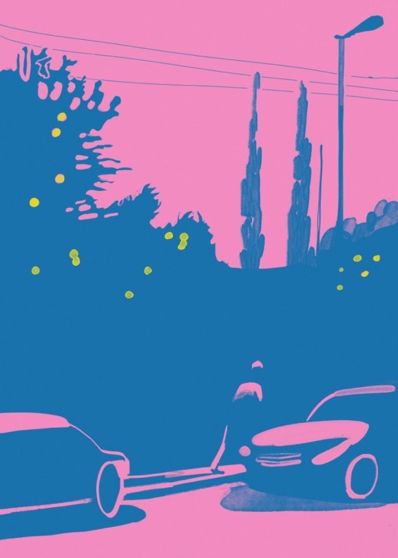
The line between the serious and the comical is tenuous and unstable. All the more so in a repertory as casual and unrestricted as Niemann’s. He prefers techniques like watercolor and ink, traditionally related to temporary results. He sketches. He improvises, very much like a jazz musician. True to the designer’s calling, he simplifies. But despite this tendency, there’s a serious vein in him. The postcards from cities like São Paulo, Stockholm, Sevilla, Gibraltar, New York, and L.A., a place he visited in the hopes of meeting David Hockney, are for the most part laconic, even meditative. Some of them feel outright gloomy, like the Californian dusk he depicted in blue and pink. There’s a pop art quality to the 360º VR drawing of the Cadiz cathedral, but the work remains respectful, broad-minded yet unsmiling. The skull cover for Wired is dead serious. The silkscreen flowers are composed.
Technically, these pieces are as accomplished as the rest. Good composition, broad but eloquent strokes, a command of perspective, sensible, often surprising color combinations, extraordinary handling of light and shadow, economy – attributes like these are ostensible. One may even say Niemann’s visual ambition rises here. The dynamics of his spherical immersions is unmatched by lighter drawings. The same goes for the detailed amplitude of a series of images in Souvenir or the occasional elaborateness in 100% Evil (coauthored with Nicholas Blechman). In my opinion, however, the works in this vein fall short. Informal to an extent, they are visually and semantically one-dimensional. Decorative in some cases, entertaining in others, they cast no spell on the observer. Moreover, they lack a distinctive style – perhaps they don’t even want it. They could have been made by any professional of merit. These pieces seem illustrations in the sense that illustrations serve a purpose and call for the displacement of authorship.
The comic work, on the other hand, is superb. It’s visual humor at its best. Take for example the grotesque compositions Niemann has been publishing as part of his Abstract Sunday column for The New York Times, now collected partially in Sunday Sketching (Abrams, New York, 2016). To produce these images, he places objects on paper, traces them to create figures and photographs the result from the proper angle. Thus, the upper-body of an otherwise drawn t-rex attacking is a pair of oldish socks. The ballet dancer’s tutu is a paintbrush. The head of a troubled green man and the hand supporting it as it leans down, a strawberry and its calyx.
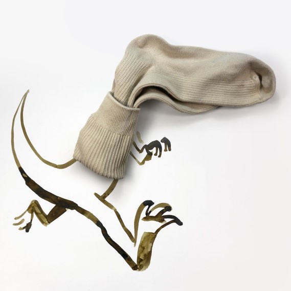
These mixed-media sketches are at once basic, precise and expressive. Niemann relies on simple things – art utensils, in general – and simple illustrations. The utensils and the drawings (the volume and the area) match seamlessly. And the composite figures deliver meaning and feeling. An exercise such as this points not only to an alert fantasy and a wit but also – and perhaps principally – to observation, that is to the love of forms. I can picture the artist contemplating a piece of bread, taking pleasure in the obviated beauty and evocation of its shapes.
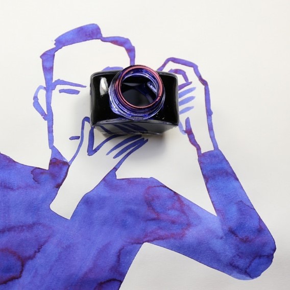
But what satisfies the most is the comical effect. Humor disfigures, juxtaposes the dignified and the lowly estates of the same object – a person, an animal, an idea… In doing so, it ridicules. In a good caricature, a tyrannosaurus is already debased. The brutality we know of overlaps with harmlessness (Toy Story’s t-rex is funny because it’s sensitive). Consider now that the monster’s head is a bundled pair of socks the creases of which show fury. One cannot help but to think: “This foot-headed animal believes it’s the real thing.” Moreover, Niemann debases his own trade: worn, perhaps smelly socks on the drawing board and at the heart of the author’s oeuvre. Like all notable humorists, he becomes the subject of his own mockery. Behold the ballerina‘s long, lean arms, the hands’ call for flight and lightness, the svelte impulse of the legs. She’s delicate, dedicated … and her torso is a basic tool, her tutu made of coarse bristles. The green man is tormented, but his head is full of pulp. My favorite is the lensman. He takes himself so seriously, yet he’s holding an ink bottle. Is that Niemann’s blue likeness, shooting his own camera back? An instance of two photographers snapping each other at once, or a funhouse mirror perhaps. Humor self-inflicted again. Comicality aside, some of these works are formally delightful. The yellow banana-horse, for example. The mug-man stretching and yawning. The black dropper-toucan.
Niemann has used other media to perform this operation (matching reality and artifice). In a series of images for the 2019/2020 season campaign of Deutsche Oper, he displays black ink to draw music figures on photos. Not all of them are interesting. One is brilliant: the upper sphere of the Fernsehturm (Berlin’s emblematic tower) constitutes the expanded chest of an opera singer, just as he, face turned upward, mouth wide open, arms theatrical, delivers his most difficult note, perhaps the distinctive High C. For Hermès, the fashion house, he mixed typical footage of New York City – close-ups and panoramic views – with monochrome animation and added ambience music. The brunette blowing kisses from a pedestrian crossing light is adorable, classy and amusing.
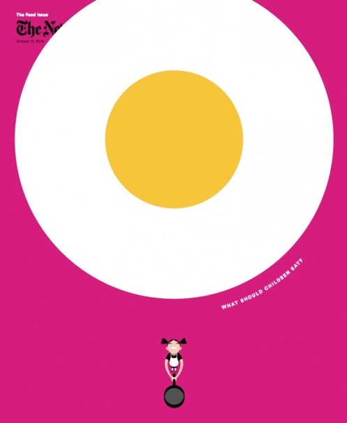
Mixed-media is at the heart of Niemann’s work, but his humor transcends it. Consider if not some of the newspaper variations or Daily Drawings he did for The New York Times, in which readers and the oversize pages they are reading correlate in fantastic ways, like the gargantuan smile and the clown behind it. Or a few of the maps he collected under the title My Way. Or the cover for the kids’ food issue of The New York Times Magazine, one of his best images: a fried egg so close to us it fills most of the space and, far below, the tiny shape of the amused girl who just tossed it.
Some of Niemann’s comic pieces are relatively complex. The September 30, 2019, cover for The New Yorker necessitated four panels and quite a bit of drawing to comment on the progressive integration of computing systems and people. The premise, however, is crystal clear. Not so much so here, where the fancy visual syntax carries a sinuous idea. Both as an image and as a formulation, the plate of the girl reading inside her tent, in the middle of the forest and by the light of her cell phone, is, in my opinion, disperse.
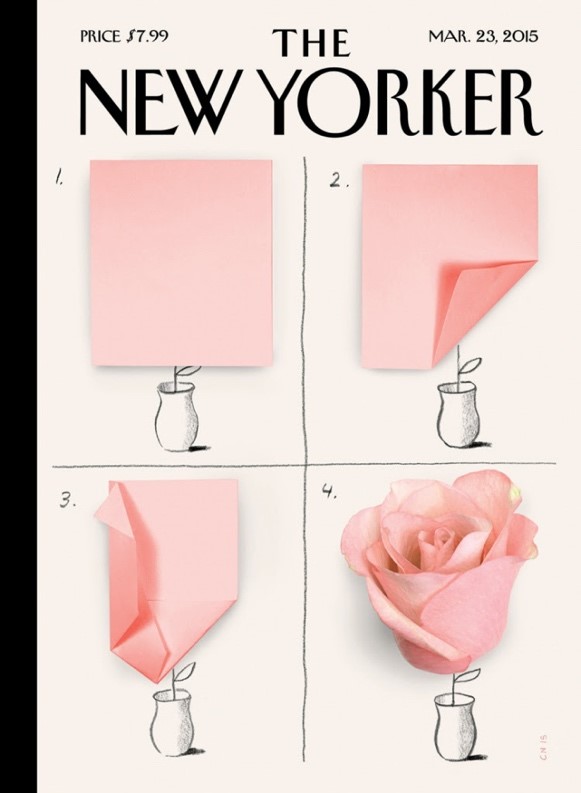
But many other comic pieces are graphically and/or conceptually modest. They rely on drawings, compositions or animations as basic as the cyclist sketched on a car’s side window, the Ceci n’est pas une pipe parody and The Story of my App interaction. Or on ideas as candid as that of two autumn trees branch-racketing a leaf. And it’s precisely here, in this elementary field, that the artist blossoms. Niemann’s sense of humor is very much like that origami pink flower he portrayed for The New Yorker as it took form: two or three unpretentious folds and, voilà, the full rose effloresces.
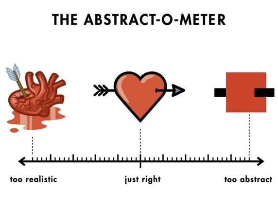
Simplicity, however, is not all. Yes, Niemann is good at taking something complex, slicing dispensable elements away and revealing the essence, an ideal he assumed and explained in this article for The New Yorker. He’s good at boiling down notions, but he’s also unpretentious. The less he seems to aspire to, the more comfortable and generative he becomes. He either relapses into a childlike condition or appears to be working for the young in spirit. He employs infantile materials. The gummi bears, for example; Lego pieces; socks, mandarin oranges, a fork. He sketches rather than draws. He improvises. He humanizes animals, degrades adults, has fun with food, introduces other children, throws a clown into the mix. Niemann comes to live when he plays. There’s something puerile in every humorist. In his case, it’s the heart.
Niemann’s tender constitution explains a lot. Why he looks into the mirror and finds “an eternal preteen.” Why at least half of the books he has published are for children (e.g. The Potato King, Words and The Pet Dragon). Why he’s the father of three boys in a time and a stratum (bourgeois metropolitan) where the one-child alternative propagates. Why a significant portion of his work has to do with his sons, like the Mural for Berlin Train Station, a derivative of the tile New York subway map he designed in their bathroom when the family moved to the German capital. Why he undertakes traveling as a means back to innocence, that is seeing for the first time and wondering, very much to the satisfaction of media likeNational Geographic and The New York Times. Why the creative process and its parts – ideas, outlines, drafts, materials, etc. – are often visible through the product or are the product itself, as if to downgrade the result, emphasize the process and conjugate both as playing. And why he doesn’t care much about being “acknowledged as an artist in a museum”. Fine art, he banters in this visual essay, proceeds from serendipity and diversion.
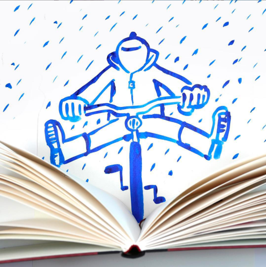
Fine art glorifies the individual genius, the signature. It obsesses about style. Fine art seeks innovation because innovation sets the author apart. It favors virtuosity, either of form or intellect, for the same exact reason. In fine art, every effort and every progression is ascending, it all tends to a pinnacle, the acme of thought and sensibility. Fine art is vertical. It privileges the intimate aesthetic experience – beauty, they call it – over the multiple, collective joy and relief. Low art and its offspring, comic illustration, live on the anonymous, plain, contributions of people. Someone produces the piece and, in a way, the piece is hers, but its ordinary nature, its accessibility and the belief that it is replaceable diminish authorship and democratize the origin. Unlike fine art and its pursuit of transcendence, low art is rather practical and seeks an immediate effect. It either works or doesn’t. It’s either funny or dull. Change is seldom sought after. Change occurs, it’s circumstantial, the result of accidents. Low art is inviting, open, approachable. Modest and hence horizontal. From all, for all.
Christoph Niemann’s work ripens as it gets simpler, humbler, more immediate. He’s – paradoxically – an exceptional low artist.

Ignacio Ortiz Monasterio
Ignacio Ortiz Monasterio (Mexico City) is the author of two books, Compás de cuatro tiempos (2015) and Anatomía de La feria (2018). His essays and stories have appeared in The Southern Literary Journal, Mayday and Spanish-language magazines like Este País, Nexos, Luvina and Letras Libres. He received a Fulbright grant to attend Emerson College’s writing and publishing program.
- Web |
- More Posts(2)


