You have no items in your cart. Want to get some nice things?
Go shoppingCourtesy of Riot Material
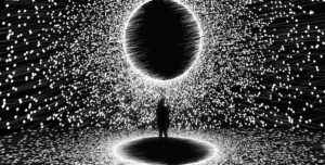
Imagine entering a large raw space plunged in darkness. A few structures barely emerge out of the gloom, adding complexity to the basic box: a cube, a rectangular cuboid, and a cylinder. Images start fading in or flaring up on the black surfaces. Hugely enlarged photographs of people, buildings, bridges, paintings by super famous artists such as Van Gogh and Picasso and Michelangelo fill sequentially the vertical planes. Decorative or architectural elements from every period — balustrades, cornices, columns, metal arches, clockworks are projected on the smaller structures and on the floor. The photographic or graphic elements or details from the paintings duplicate, triplicate, multiply, creating a rhythmic composition. Blown-up out of all proportions, they are then shrunk back to flash, strobe, fade-out, zoom-by at high speed, making it all the more surprising that warnings for epileptics are not issued at the entrance. The experience is not unlike standing at Times Square at night, but the honks of the city are replaced by a classical music track, and fewer people mull around gaping at the bright spectacle. In fact, there is no need to even move, as the show takes place all around, and people do sit or even lie down.
This frenzy of unrelated images might puzzle the viewer who’s come to see a Klimt exhibit. It is the branding piece for Culturespaces, an international company that manages and promotes art spaces, with a specialization in producing immersive experiences.
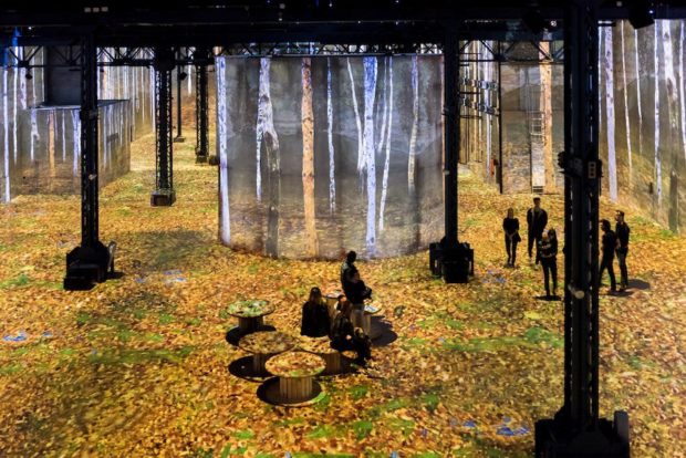
Once the promotional program is over, the space turns into a 1900s Viennese palace of lights, rather magical, followed by syncopated sequences of photos of buildings and people from the era. The main show, focused on Gustav Klimt, has started. His famous portraits – women mostly,as the artist stopped painting men early in his career – are hugely enlarged and projected on the higher parts of the planes. The faces are programmed to appear multiple times at the same instant, like an advertisement campaign with a bloated budget, they rotate, they flash on, they fade, they slide down the walls, they dissolve like rock turning to sand. If Klimt had painted just people’s faces, he would have been a good portraitist. His depictions of faces are striking, but quite enslaved to Jugendstil, and not unlike portraits by Koloman Moser, Ferdinand Hödler or Alphonse Mucha. If he had come up just with great decorative patterns, he would have been a pretty good designer too. His claim to high art comes from contrasting his nuanced portraits with stylized graphic elements.
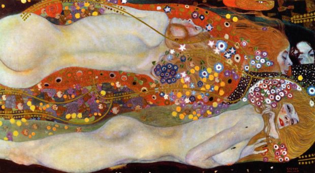
When it came to using Klimt’s trademark decorative elements, the designers of the show were clearly in pigs’ heaven. The repeated patterns turn the floor into a gigantic carpet that swirls around, inviting the visitor to play hopscotch with its figures, or to dance. His snakelike women, from Water Serpents II, 1907, slither across the carpets, as if threatening to drag the visitor down to a murky underworld. Motifs climb up and down the architectural structures in seemingly geometric feats, bend around the curves of the cylinder. They zoom by at high speed, duplicate, triplicate, multiply, flash, strobe, fade in, fade out to form a rushed kaleidoscope. In striking contrast tothe black backdrop, the famous Klimt gold, the greens, the blues, reds, yellows, emulate the glorious stained glass of cathedrals, but animated by an angel on LSD. In fact, an angel, probably picked from a famous Klimt frieze in Vienna, is subjected tothe same frantic multiplication as other portraits. The stained glass effect, the cathedral dimensions of the space, as well as the goddess like quality of the women staring us down from their dizzying heights, informs the whole experience with a gothic quality. Not inappropriately: Art Nouveau flirted with the late 19th Century Gothic Renewal, attracted less by its god than by its predilection for the supernatural. And this immersive experience has plenty of the supernatural, with its volumes and their disappearing act, its shape shifting humans, its animated worlds brought to life ex nihilo.
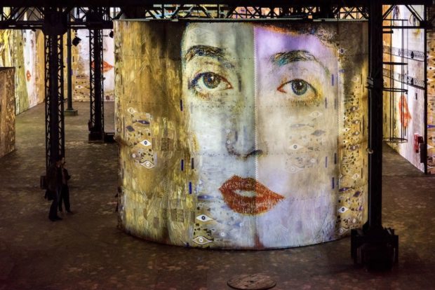
There are pretty much two ways to react to the spectacle on offer. If we listen to the rationalist in us, the critic, the art historian, the theorist, we will shake our head at the extravaganza, lips pursed, hands joined behind our back. Tsk tsk tsk. And with good reason. Poor Gustav certainly doesn’t benefit from the treatment. Anything one might find objectionable about his work, his preciosity, decorativeness, his subjugation to Art Nouveau trends, is amplified by the relentless projection of his images. We might not have time to identify all the paintings used, but it’s definitely the Klimt “brand” that is splashed on all surfaces. The music track adds to the weariness by playing classical music clichés from the 1900s, and from other periods too: the obligatory waltz by Strauss, Mahler, Beethoven, Wagner’s opening to Tannhauser, Chopin, Philip Glass. The eye candy, ear candy too, is offered relentlessly, and we all know what comes from eating too much sugar. When the images are different from the Klimt we’re used to, such as his late impressionistic landscapes, they leave us merely disoriented. We don’t get a sense of the paintings, as the composition, the dimensions, the colors even, are modified by the projection.
A painting is a tri-dimensional object with a frame and a particular texture, whether the paint has been applied in a flat coat or with thick impasto. We usually can’t touch paintings by famous artists but they are touchable, and singular. If we allow that a painting has a soul, it is a being. Here, immaterial information in the form of pixels plaster the walls with images reproduced to the umpteenth degree. In a regular exhibition, the visitor chooses how long to spend in front of each painting, whether one appeals more, or might exhibit more complexity. Some of the expressive details take time to discover, such as the head of Holofernes blinking near Judith, or the erotic flesh delicately rendered against its stylized decor. The low point of view of the painter/viewer enhances the women’s erotic power, as do their facial expressions. Klimt also enjoyed a strong sense of composition, with silhouettes and background elements often twisted with extreme mannerism for drama. But the show dissects the elements of the paintings, severing the relationship between the sitters and their surrounding jewel cases. The compositions are created by the juxtaposition of details either identical or contrasting, the movements of images on the three dimensional structures, their rhythmic appearances and disappearances, and can only be attributed to the designers. It is certainly not a Klimt exhibition, immersive or otherwise.
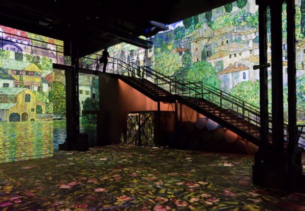
The other way to look at the show is to silence the critical art connoisseur. If we allow the young child in us all to abandon disbelief, we may enjoy the spectacle for what it is: a son and lumière show. The artists here are the designers Gianfranco Iannuzzi, Renato Gatto, and Massimiliano Siccardi, from Immersive Art Factory. Mapping, the animated projection of images on architectural structures, has been popular for many years, mostly on the outside of buildings. Bringing the show inside means that the technique can be taken further, using mirrors for example, and resulting in even more magic.
Let’s go behind the scenes: l’Atelier des Lumières, a renovated foundry, offers its walls as well as a disused water tank and chimney to the high tech frescoes, and that’s over 21,000 square feet of floor, and 35,000 square feet of projection area. 130 Barco videoprojectors were used, no numbers provided for mirrors, cables, computers, voltage, lumens, algorithms. The show gives an impression of awe, similar to that felt by audience at the first projections of the cinematograph. When the moving image was invented, the words only followed later: shot, close up, pan, zoom in, dissolve. Here too, the vocabulary is missing to describe this new medium, and all its flabbergasting techniques.
Egon Schiele
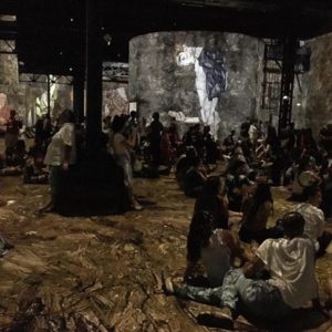 While the Klimt show will appeal to the easily impressionable viewer, the second, shorter piece on Egon Schiele takes a more sophisticated approach. The designers have chosen, wisely, to focus the program on the artist’s outstanding draftsmanship. A glorious gold line is projected against the black backdrop, highlighting the elegance of his figures. The medium, however, does not shed light on the work of Egon Schiele, who never painted on black, anymore than it did for Klimt. The color images of his work are projected with more sobriety than Klimt’s. But the seediness of his paintings, whether of barely pubescent girls or contorted young males, is transformed into glamour by the medium, by the huge scale of the projections, by the animation. The works have been selected to allow in visitors of any age, at least by French standards, and that excludes the more risqué drawings of masturbation and homosexuality so valued by erotomaniac collectors.
Still, the tragic in Schiele’s work does come across, the vulnerability of youth, the mortality of the flesh. Whether the tragic in Schiele can’t be silenced, or whether the designers’ choices succeed in amplifying it, the more sober presentation of the Schiele show comes closer, perhaps, to the spirit of the artist. Some of Schiele’s lesser known works include landscapes and houses. Their decorative elements, surprisingly playful and spontaneous in shape and color, bring to mind Hundertwasser, Schiele’s heir, rather than his mentor Klimt. Schiele and Klimt’s work also celebrate sexuality in different ways. Schiele’s eroticism could be called perverse on account of the unhealthy, twisted bodies he liked to picture. Klimt offered veneration of Nature’s goddesses, and his women are the picture of health. In fact, he is one of the first painters, with Paula Modersohn-Becker and her famous self-portrait, to represent a naked pregnant woman: quite a scandal at the time.
Friedensreich Hundertwasser
There is nothing erotic about Hundertwasser, but he was a simpatico human, probably more so than Klimt and Schiele. His values marched way ahead of his times: anti consumerism, anti capitalism, anti conformism, pro ecology. Most art historians would not deem him a major artist, but an agreeable cross between a designer, an illustrator and an architect. In fact, his Hunderwasserhaus in Vienna competes with the 19thcentury palaces by attracting millions of visitors. The simple, colorful shapes he favored match nicely the geometric structures inside the Atelier des Lumières. Trains, boats, houses multiply joyously on top of each other, chugging, blinking, tooting. Colors are primary, faces primitive. His work, and this part of the show, is bound to appeal most to children under the age of 8. Friedrich Stowasser (1928-2000) took as his artist’s name Friedensreich Regentag Dunkelbunt Hundertwasser, or Empire-of-Peace Rainy-Day Dark-Multicolored OneHundredWater. He must have had a sense of humor. Gustav Klimt (1862-1918) showed no sign of a sense of humor in his work. But he was generous. He mentored by providing models and patrons as well as constant encouragements to young Egon Schiele (1890-1918).
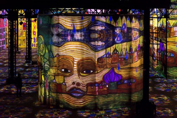
Why organize a show with these three artists? What do they have in common? All three were indeed born in Vienna, but Hundertwasser became a citizen of New Zealand, which is about as far from Austria as you can get. Also, they’re all dead. It’s the 100th anniversary of Klimt and Schiele’s death, and a number of institutions are celebrating the occasion. Klimt’s life was not cut too short, but Schiele, who did not die of an overdose or of a prolonged orgy as could be presumed, was snuffed out at 28 by the prosaic Spanish flu. Perhaps what they share most is that their paintings are highly popular with people who are not particularly well-versed in the arts. Posters of Schiele’s work can be found on teenagers’ walls, reproductions of Klimt’s bling paintings brighten up spas and jewelry stores. Countless oil reproductions of Hundertwassers and Klimts sell on the Internet, as well as cushions, scarves, skirts, bracelets, beer glasses, Barbie dolls, cake tins, dog blankets, socks, and much, much more. The Wien museum actually had a contest for the most kitsch Klimt object, and the competition was fierce.
The Vienna Secession
There is more to link the three artists. It’s called The Vienna Secession. Klimt was one of the founders, Schiele joined, and it influenced Hundertwasser. Rather than an artistic movement per se, since Klimt was a Symbolist and Schiele an Expressionist, the Secession was a reaction against the academic style that Klimt had heartily subscribed to until his brother and his father died. Otto Wagner, a Secession architect, had a striking formulation for the movement: “To show the modern man his true face.” The first issue of Ver Sacrum, the magazine of the Secession, stated: ‘We recognize no distinction between high and low art, between art for the rich and art for the poor. Art is a universal good.’ That is quite apt as the artists’ work has the broad appeal that defines pop culture.
So does the Atelier des Lumières show. Located in an unlikely neighborhood, where people live and go out, and which was the target of the terrorist attacks of November 2016, the venue welcomes with its first show a public that is more varied than at a regular exhibition. Bruno Monnier, President of Culturespaces proclaims: “The passive observation of works of art is no longer relevant, and I’m convinced that people are increasingly learning about art through this immersive experience and the emotions they generate. The marriage of art and digital technology is, in my opinion, the future of the dissemination of art among future generations, as it is able to reach a younger and wider audience than that of the traditional museums.” After the Austrian show is over, it is followed by something quite different. The short program, entitled Poetic_Artificial_Intelligence, covers the walls with words that, again, multiply, strobe, tessellate. They zoom up, they zoom down, they create dramatic symmetries. Made from scratch, rather than using existing imagery, the piece comes across as more creative than the iconorrhea we have just witnessed. Yes, that is a neologism, from ‘icon’, the image, and ‘rrhea’, the flow. The lines of words, then the abstract patterns of light create satisfying geometries. Here, the algorithms manipulate light as its source material, rather than images and colors. We forget that we are still bombarded by information to enjoy the immersion in a weightless universe that scintillates. It is as if we witness the initial Big Bang and the resulting cosmos sprinkled with shooting stars and Milky Ways. This imaginative celebration of the demiurgic by OUCHHH, an international creative collective, comes across as a piece of contemporary art in itself, while the programs about the artists belong to moneymaking pop culture. And whether that is art or not is a long discussion.
Finally, since we have established most of the program belongs to the realm of pop culture, here’s a little trivia: Klimt, who courted successfully most of his upper class sitters and models, and wore nothing under his painter’s frock for faster action, fathered 14 illegitimate children in what can only be termed as Applied Arts.

About Arabella Hutter von Arx
Arabella Hutter is a writer with a particular interest in women issues and the arts. She writes articles about art and literature for magazines, pieces about New York City for European newspapers, and her fiction is represented by Lotus Lane Literary. She has a background as a film and television writer/producer whose work includes films and documentaries for the British Film Institute, the BBC, and Channel 4, in addition to several international independent and experimental films. She collaborated on 14 episodes of "Inside the Actors' Studio" for Bravo with Glenn Close, Jessica Parker, Holly Hunter, Gene Wilder, and more. She was the Executive Director of The International Quorum of Motion Picture Producers from 2012 to 2015. Raised in Switzerland, based in Brooklyn, she travels the world on a regular basis with a preference for India, Thailand, Turkey, and Italy.
- Web |
- More Posts(3)


